If your website is not converting leads, the problem usually isn’t just “not enough traffic.” It’s that visitors arrive, feel unsure, and leave without calling, booking, or requesting a quote. For a service business website, conversion means turning a visitor into a real inquiry. That could be a phone call, contact form, consultation request, or estimate request.
In this guide, you’ll diagnose the most common website conversion problems one page at a time. You’ll look at your offer, search intent, calls to action, mobile experience, trust signals, and forms. By the end, you’ll have a practical checklist you can use to improve website conversions without guessing.
Quick Summary
- Traffic only matters when visitors understand your service and know what to do next.
- A vague offer makes even interested visitors hesitate.
- A landing page not converting often has an intent mismatch between the ad, search result, and page.
- Mobile friction can quietly kill calls and form submissions.
- Trust signals help visitors feel safe enough to contact you.
- Shorter forms and clearer calls to action usually make the next step easier.
Traffic is Not the Same as Growth
Traffic is not growth because visits only help when the right people take a lead-generating action. A page can get many visitors and still fail if they don’t understand the service, trust the business, or find the next step.
Think of traffic like people walking past a shop. Growth happens when the sign is clear, the door is easy to open, and someone knows what they’ll get inside.
Check visit quality before chasing more traffic. Look at which page people land on, how long they stay, and whether they click a phone number, form, or booking button. If the site is slow, confusing, or technically messy, stronger Web Development can support better lead capture.
Do not treat every visitor as equally valuable. Someone searching “emergency plumber near me” is more ready to act than someone reading a broad maintenance article.
Your Offer is Unclear
Your offer is unclear when visitors can’t quickly tell what you do, who you help, and why they should contact you. It is one of the simplest conversion problems to spot and one of the most common.
Read the first headline on your main service page. Does it name the service, audience or location, and outcome? “Quality Solutions” sounds positive but says little.
A stronger version is: “Residential Roof Repair in Austin With Fast Leak Assessment.” It shows the service, customer type, location, and value. You need clarity, not fancy wording.
Fix the offer by answering these questions near the top.
- What service do you provide?
- Who is it for?
- What problem does it solve?
- Where do you provide it?
- What should the visitor do next?
Avoid broad descriptions like “We handle all your property needs” unless the page immediately lists specific services.
The Page Does Not Match Search Intent
A page does not match search intent when it answers a different need than the visitor had before clicking. Search intent is the reason behind a search, such as learning, comparing, booking, or finding urgent help.
This matters for search engine optimization and pay-per-click. If someone clicks an ad for “same-day boiler repair” but lands on a general homepage, they have to hunt. Many won’t.
Use this test. Read the search phrase, ad message, or page title that brought the visitor in. Then read the landing page headline. Do they promise the same thing? If not, you’ve found a mismatch.
For organic search pages, your SEO strategy should connect each important service keyword to a page that answers that exact need.
Weak page: A PPC ad says “Book a Drain Cleaning Estimate,” but the click goes to a homepage with plumbing, heating, remodeling, and maintenance.
Better page: The click goes to a drain cleaning page with symptoms, service area, process, phone button, short form, reviews, and “Request a Drain Cleaning Estimate.”
A call to action is weak when it doesn’t tell visitors what to do next. Place your main CTA near the top, after key sections, and at the bottom. On mobile, make the phone button easy to tap.
Common CTA fixes:
- Use one primary CTA per page.
- Add a click-to-call button for mobile users.
- Make button text readable and direct.
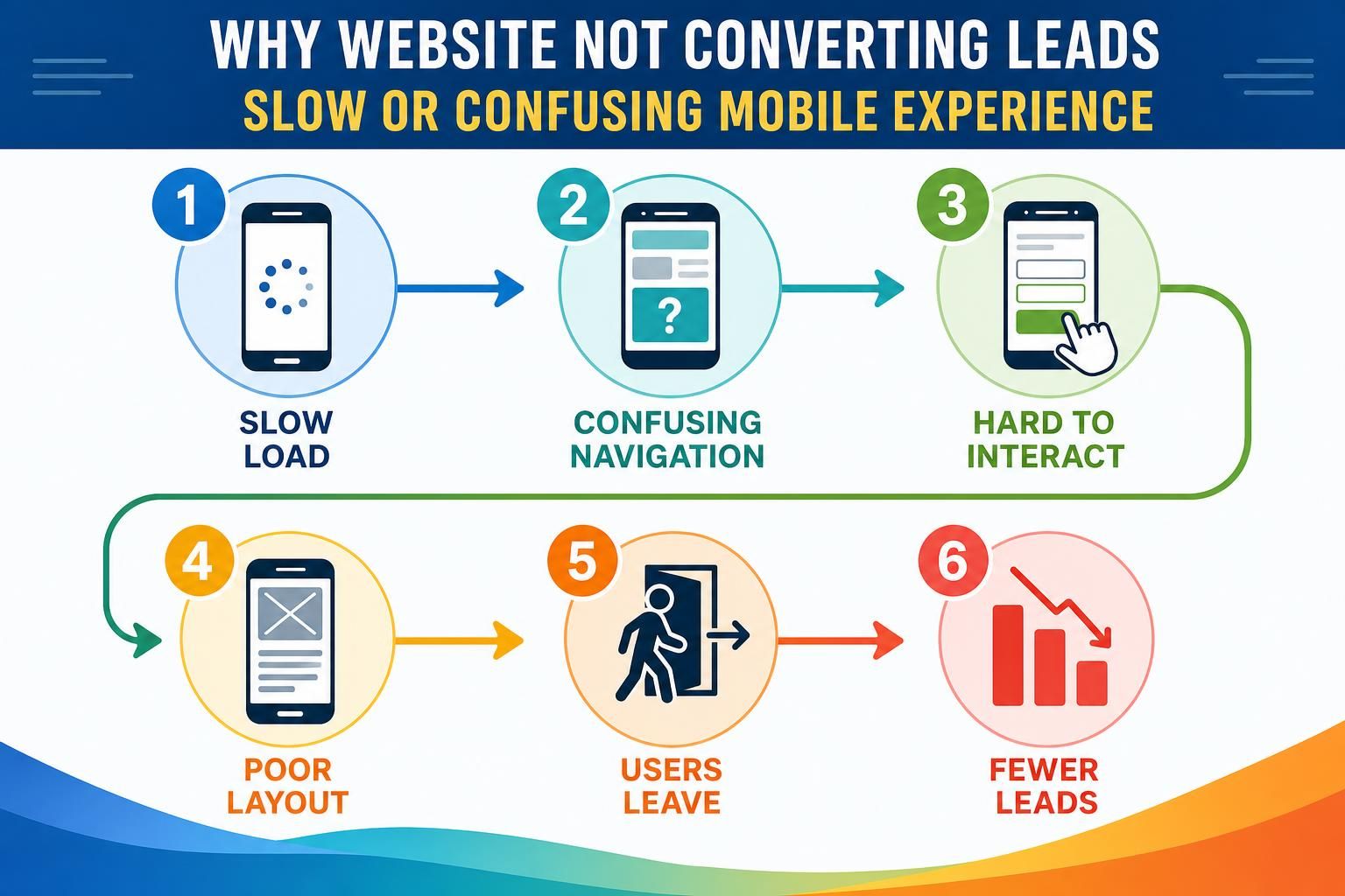
Slow or Confusing Mobile Experience
A slow or confusing mobile experience stops leads because many service customers visit while busy, stressed, or away from a desktop. If they have to pinch, zoom, wait, or hunt, they often leave.
Picture a homeowner with a leaking pipe. They open your site on a phone and want to call quickly, but the phone number is buried, the menu covers half the screen, and the contact button is tiny. That is lead loss.
Test your page like a customer. Open it on your phone using mobile data. Try to call, find your service area, read the headline, and submit the form. If any step feels annoying, fix it.
Focus on these mobile basics:
- Make the top headline readable without zooming.
- Keep the main CTA visible early.
- Use tap-friendly buttons.
- Compress large images so pages feel faster.
- Keep menus simple.
For PPC campaigns, mobile problems can waste ad clicks because paid traffic arrives with a specific expectation.
Missing Trust Signals
Missing trust signals make visitors wonder whether your service business is real, qualified, and safe to contact. A trust signal reduces doubt, such as reviews, project photos, credentials, guarantees, process explanations, or local details.
Service leads often involve risk. A customer may invite someone into their home, trust you with an expensive repair, or share personal contact details. If your page claims reliability without proof, visitors may pause.
Add trust signals close to the decision point. Put a short review near the form, show project images near service details, and explain what happens after they reach out.
Avoid generic claims like “best in town” unless you can support them. Real details beat hype.
Forms Create Too Much Friction

Forms create too much friction when they ask for more effort than the visitor is ready to give. Friction is anything that makes the action feel harder, slower, or riskier.
A quote request form that asks for full address, budget, timeline, uploads, and detailed notes may scare off early-stage visitors who do not know the answers yet.
Start with the minimum details needed to respond well. For many service businesses, that means name, phone or email, service needed, location, and a short message. Ask follow-up questions later.
Use helpful labels instead of cold field names. “What do you need help with?” feels easier than “Project Description.” Add reassurance near the form, such as “Tell us the basics and we’ll follow up with next steps.”
Common fixes include removing optional fields, splitting long forms into steps, adding a phone alternative, explaining what happens after submission, and testing the form yourself. If someone misses a required field, tell them exactly what to fix.
To diagnose a lead generation website, inspect one important page from traffic source to final action. Pick a page that should generate calls, quotes, or bookings.
Use this step-by-step flow:
- Choose one page. Start with a high-value service page or paid landing page.
- Check the traffic source. Identify whether visitors come from SEO, PPC, social, referral links, or direct visits.
- Compare the message. Make sure the search phrase, ad, page title, and headline describe the same service.
- Use your phone. Check speed, readability, button size, and how quickly you can contact the business.
- Review trust signals. Look for reviews, credentials, project examples, service area details, and process clarity.
- Submit the form. Confirm the thank-you message appears and the lead notification reaches the right inbox.
- Find the drop-off point. Look for where visitors likely hesitate, get confused, or leave.
| Problem area | What to check | Practical fix |
|---|---|---|
| Offer clarity | Headline and first screen | Name the service, audience, location, and outcome |
| Intent match | Ad or search phrase versus page | Send visitors to the most specific service page |
| Mobile friction | Phone use and form access | Add visible tap-to-call and simplify layout |
| Lead capture | Form length and confirmation | Reduce fields and explain next steps |
Write one fix for each problem. Update the headline, CTA, form, or trust section, then watch whether lead actions become easier.
FAQ
These common questions come up when a service business gets traffic but few inquiries. The answers below are meant to help you decide where to look first without turning the audit into a technical project.
Use them as a quick troubleshooting guide. If one answer sounds like your page, go back to that section and inspect the matching part of your lead path.
Why Am I Getting Traffic but No Leads?
You may be attracting visitors who aren’t ready to buy, or your page may not make the next step clear. Check the headline, CTA, form, trust signals, and mobile layout. If any of those create confusion, traffic can arrive without turning into inquiries.
Is My Homepage Enough for Service Leads?
Your homepage can generate some leads, but specific service pages usually work better for focused searches or ads. A visitor looking for one service wants that exact answer. Send them to a page that matches their problem, location, and next step.
How Do I Know if My Form is Too Long?
Your form is probably too long if it asks for details the visitor may not know yet. Start with only what you need to respond. Then ask follow-up questions after contact. Also test the form on mobile to see how much effort it takes.
Should I Fix Design or Copy First?
Start with copy if the service, audience, offer, or CTA is unclear. Start with design if the page is hard to use on mobile or the form is buried. The best result usually comes from fixing both clarity and usability together.
Conclusion
If your website is not converting leads, treat the page like a lead path, not just a design project. Check whether the right visitor lands on the right page, understands your offer, trusts your business, and can act without friction.
Start with one important service page. Fix the headline, match the page to visitor intent, make the CTA obvious, test mobile contact options, add trust signals, and simplify the form. That focused audit gives you a clear next step and helps turn your lead generation website into a better source of real inquiries.